PayPal
An ID check people get through the first time
PayPal ID verification: a document scan and a face scan with a liveness check, designed and tested over 11 rounds of research, for iOS, Android and mobile web.
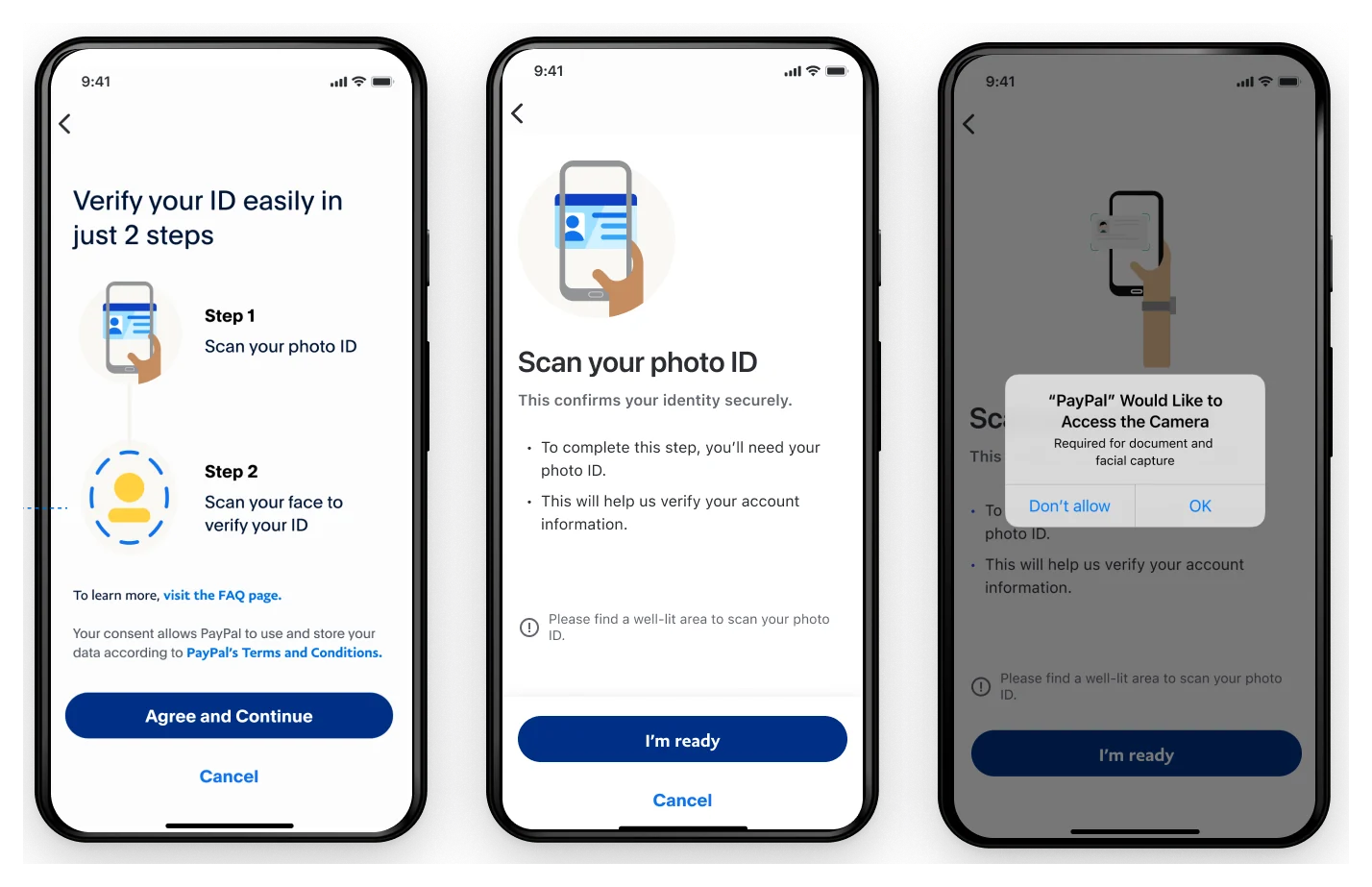
Impact
- 90%
- Captured their face on the first try
- 82.5%
- Found the steps easy to complete
- 92.5%
- Reported a positive experience
UX survey of 40 people, before launch
Case snapshot
The situation
Fraudsters were getting through, and real customers were waiting hours to prove who they were.
PayPal asks people to verify their identity before sensitive actions: high-risk transfers, crypto, account recovery. The old flow asked for a photo of an ID through a web upload form. It took 3 to 6 minutes, and if it was flagged, 6 to 24 hours of manual review.
At the same time, fake documents and synthetic identities were getting past it. In 2021 PayPal reported 4.5 million illegitimately created accounts.
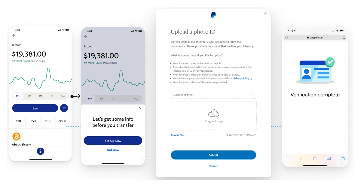
The old flow
- 42%
- Dropped off before finishing
- 68%
- Succeeded on the first try
- 2.1%
- Suspected fraud rate
What was broken
People gave up
Friction, unclear instructions and poor camera support lost 42% of people mid-task, at a moment when they were trying to move money.
Failures went to people
30% of failed checks went to manual review, which took days.
Fraud got through
Fake documents and synthetic identities were getting past a check built on an uploaded photo.
My scope
I owned the verification flow, from the first research to delivery.
- What I owned
- Research, concept, design, user testing and delivery of the verification flow: document scan, face scan, the error and fallback paths, and the permission and wait screens.
- Prototypes
- I designed 30 prototypes of the capture interactions, then built 20 native ones with an iOS engineer so we could test with live camera movement.
- Who I worked with
- A content strategist, a lead UX researcher, three product managers, two data and privacy officers and more than 15 engineers, plus Risk, Legal, Accessibility, Fraud Ops and the ML team.
- Raising the bar
- I mentored the associate and intern designers working on the project.
- The constraint
- The app could barely grow, so augmented reality and heavy on-device models were out. Every screen also had to work in a mobile browser.
The hard call
The fastest scan tested worst. I slowed it down.
The brief read as "make it smoother": fewer steps, a faster capture. My first prototypes did that, and the feedback in testing wasn't encouraging. People wanted a balanced speed of capture, and a check that didn't feel like a game.
So the design added time where it bought confidence. Each step says what it's for before the camera opens. Each capture pauses briefly so people can see what happened. The face scan asks for a slow head turn of about five seconds, and people choose which side to turn to first.
More friction didn't mean more drop-off. More time on the task didn't either.
From rapid research on the capture prototypes
Friction was also kept out of places that didn't need it. Whether to ask for verification at all depends on the risk score, the type of transaction, how trusted the device is and whether the location matches.
How the work got made
Static prototypes couldn't test a face scan, so we built native ones.
Start where verification interrupts
We mapped every flow where identity blocked access, like crypto onboarding, account recovery and high-risk payments. Then we interviewed customers, support agents and fraud analysts.
Prototypes that move
Design prototypes couldn't respond to a moving face, so the feedback was thin. With an iOS engineer I built 20 native prototypes to compare device movement with head movement. Capturing faces in motion also gave the fraud models better signals.
Test with people who struggle
We tested with participants from different backgrounds. Simulation glasses stood in for sight loss, and taped finger joints for arthritis. We worked with RNIB and the Digital Accessibility Centre.
Research over the project
- 11
- Rounds of research and design iteration
- 50
- Prototypes tested: 30 design, 20 native
- 70+
- Face-to-face interviews, plus 100+ survey responses
The craft
Every failure tells people what to change, and every wait says how long.
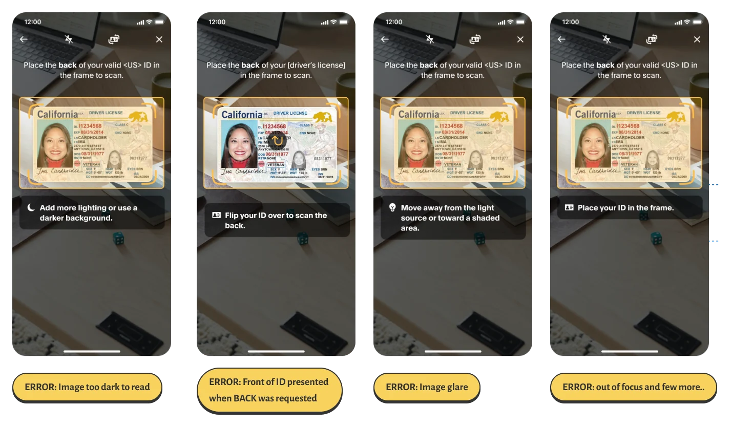
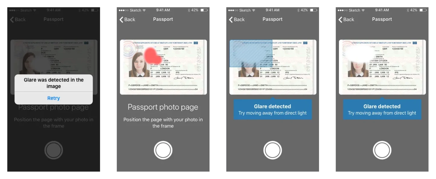
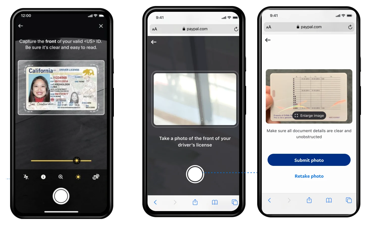
Wait screens, timed to the backend
- Document quality
- Average 3 seconds, at most 4.5.
- Document check
- Average 13 seconds, up to 25, or 50 with the second vendor. Past 10 seconds the screen changes: "Don't go yet. We're still working on it."
- Face and liveness
- Average 3 seconds, up to 10, or 50 with the second vendor.
- Capture feedback
- A ring fills as the head turns and a light vibration confirms each capture. I tested several vibration patterns with users.
- Screen readers
- Every success and error is announced, and each capture has alt text, such as "Front of ID scan successful".
Impact
In a survey of 40 people before launch, nine in ten captured their face on the first try.
UX survey of 40 people, before launch
- 90%
- Captured their face on the first try
- 82.5%
- Found the steps easy to complete
- 92.5%
- Reported a positive experience
The same survey will run before every major update. An audit by the Digital Accessibility Centre found screen reader support still short of AA, and that went into the next round.
What I'd do differently
What didn't work, and what I'd keep.
False rejections came from data, not the camera
A name or date of birth that didn't match the profile failed real people. I explored letting them update the profile from the scanned ID instead.
Adoption started slowly
Early adoption was low, and device-specific OCR problems hurt some phones. Asking at the right moment mattered as much as the scan itself.
Fewer clicks isn't always better
The lesson I'd keep: a little friction, explained, builds more trust than speed people can't follow.
For the detailed case study, reach out to me (opens Gmail in a new tab).