PayPal
A debit card people finish signing up for
PayPal Debit Card: rebuilding card enrollment inside the PayPal app around identity checks and fee disclosure, and adding cash back offers, so more people finish signing up and start using the card the same day.
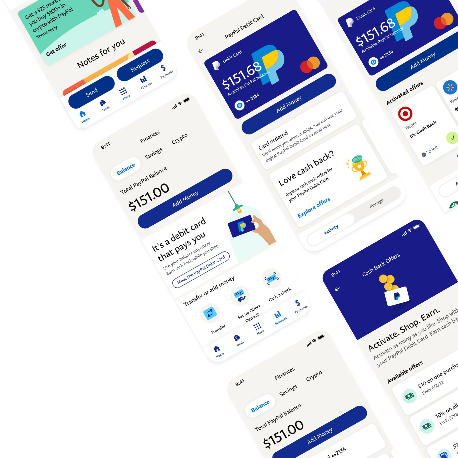
Impact
- 20%
- Faster card applications
- 18%
- More cards activated the same day
- 25%
- Fewer support calls about shipping
Business
Case snapshot
The work
Sign up, use it today, then a reason to keep using it.
Finances
Total PayPal Balance
$151.00
Add MoneyIt’s a debit card that pays you
Use your balance anywhere. Earn cash back while you shop.
Transfer or add money
Use PayPal at all your favorite places
- Use PayPal at your favorite places
- Spend from your PayPal balance
- No monthly fees, no credit check
- Includes access to Direct Deposit
The PayPal Debit Mastercard® (“PayPal Debit Card”) is issued by The Bancorp Bank pursuant to a license by Mastercard International Incorporated. Mastercard is a registered trademark and the circles design is a trademark of Mastercard International Incorporated. This is a debit card linked to your PayPal Balance account and is not a credit card. The Bancorp Bank is issuer of the Card only and not responsible for the associated accounts or other products, services or offers from PayPal. Card may be used everywhere Mastercard is accepted.
The PayPal Debit Mastercard® provides cash back offers for all eligible purchases. Current offers are visible in the PayPal app and rotate on a regular basis. Each cash back offer is subject to additional terms and conditions.
By clicking on “Get Your PayPal Debit Card”, you agree to and accept the terms in the PayPal Debit MasterCard® Cardholder Agreement and the Bancorp Bank Privacy Policy.
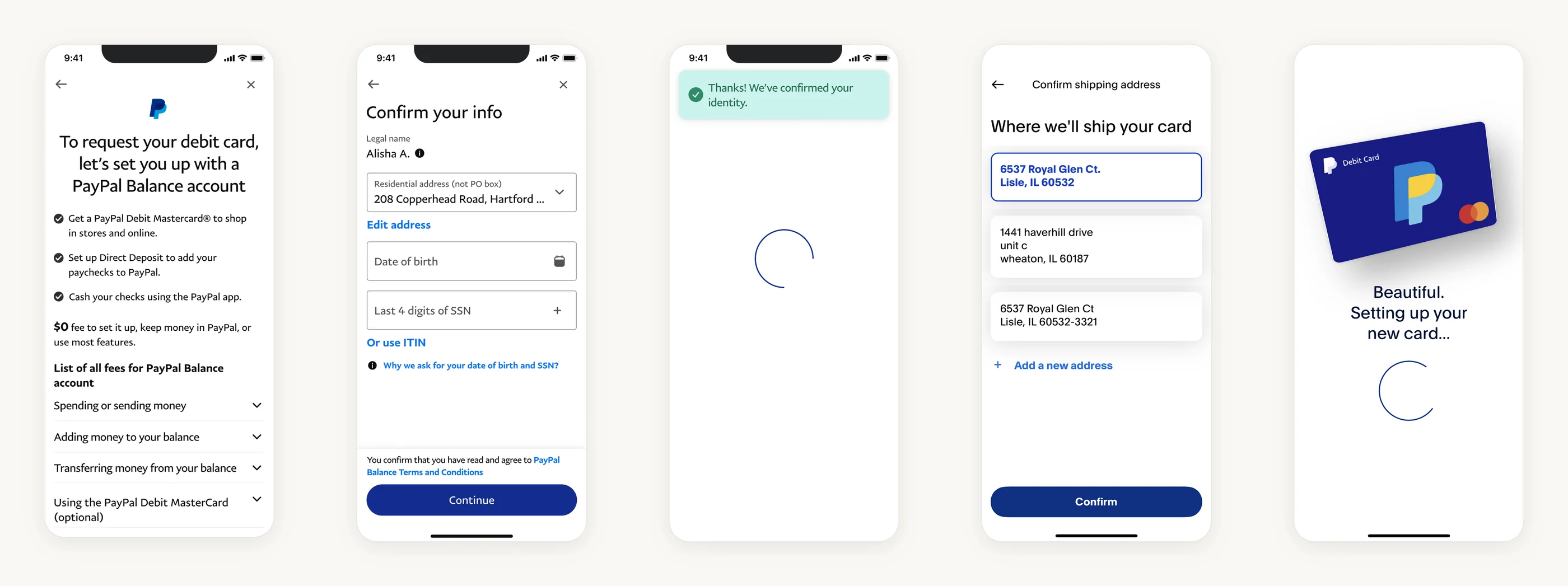
To request your debit card, let’s set you up with a PayPal Balance account
- Get a PayPal Debit Mastercard® to shop in stores and online.
- Set up Direct Deposit to add your paychecks to PayPal.
- Cash your checks using the PayPal app.
$0 fee to set it up, keep money in PayPal, or use most features.
List of all fees for PayPal Balance account
- Spending or sending money
- Adding money to your balance
- Transferring money from your balance
- Using the PayPal Debit MasterCard (optional)
Confirm your info
Legal name
Alisha A.
Edit address
Why we ask for your date of birth and SSN?
You confirm that you have read and agree to PayPal Balance Terms and Conditions.
Confirming your identity
Where we’ll ship your card
+ Add a new address
Beautiful.
Setting up your new card…
Finances
Total PayPal Balance
$151.00
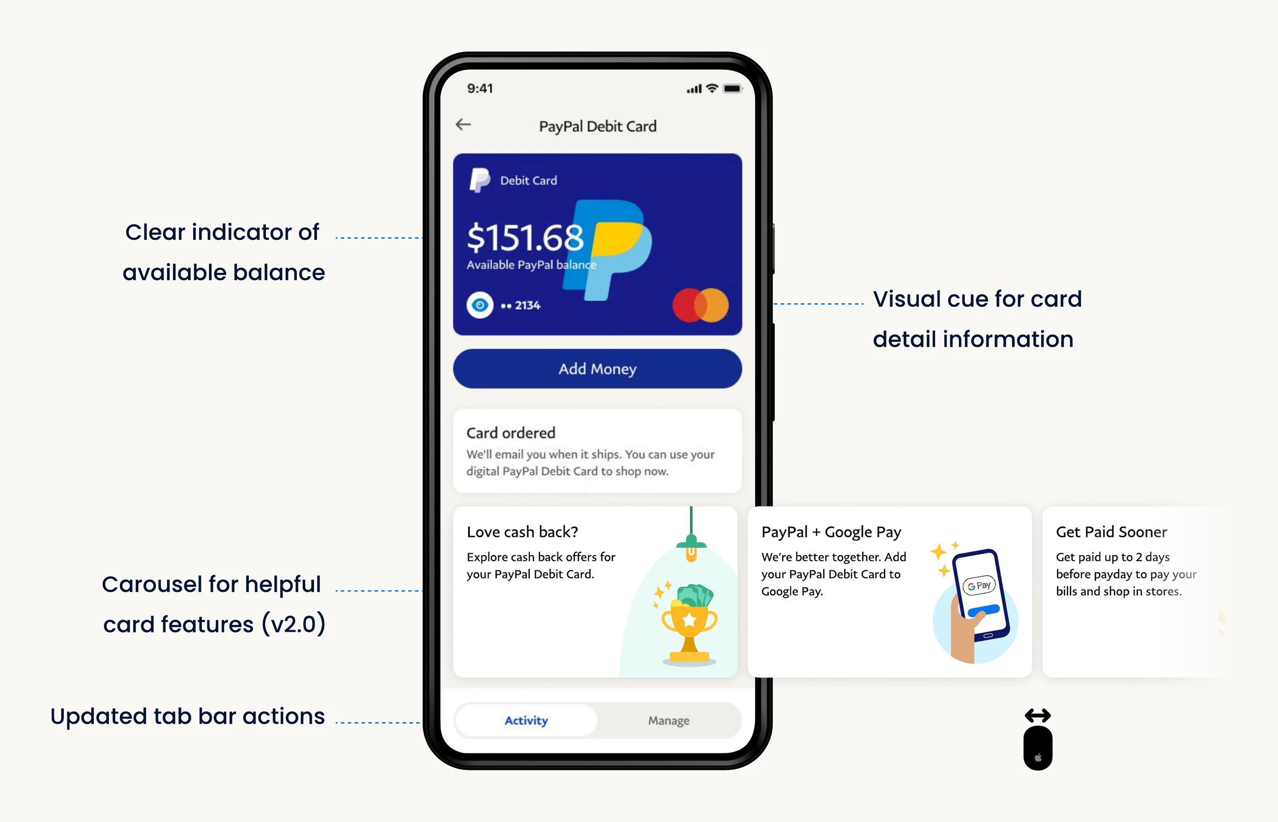
Add MoneyDebit Card ••2134
✓ OrderedLove cash back?
Explore cash back offers for your PayPal Debit Card.
Explore offers
Try the flow
PayPal Debit Card
Love cash back?
Explore cash back offers for your PayPal Debit Card.
Activated offers
- StarbucksPurchase · March 15$14.92
- NetflixPurchase · March 12$14.99
Activate. Shop. Earn.
Activate as many as you like. Shop with your PayPal Debit Card. Earn cash back.
Activated offers
Expiring soon
Available offers
Details
How it works
- Activate this offer.
- We’ll automatically add your cash back to your PayPal balance.
Try the flow
Simulate time passing
Activate the Target offer first.
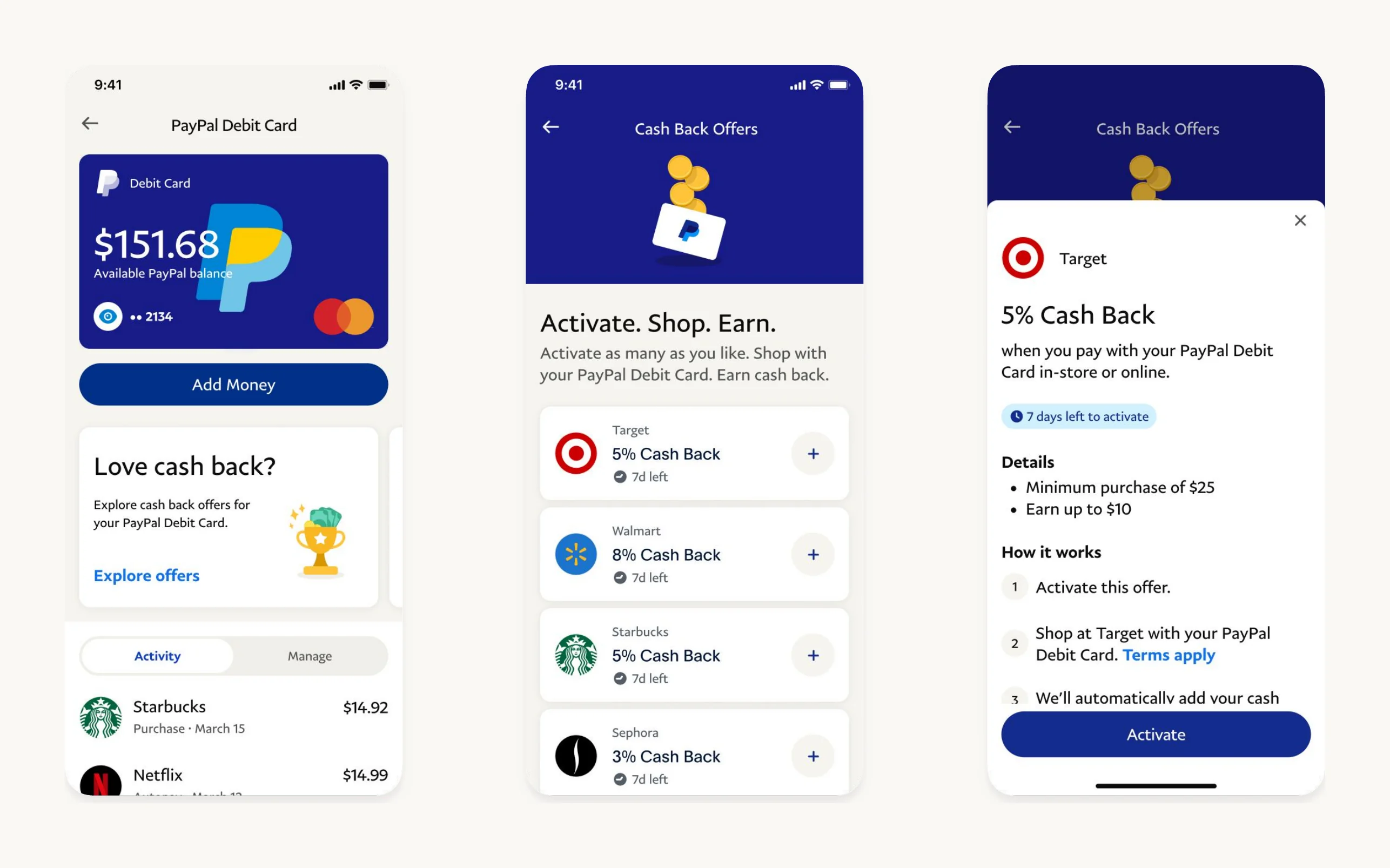
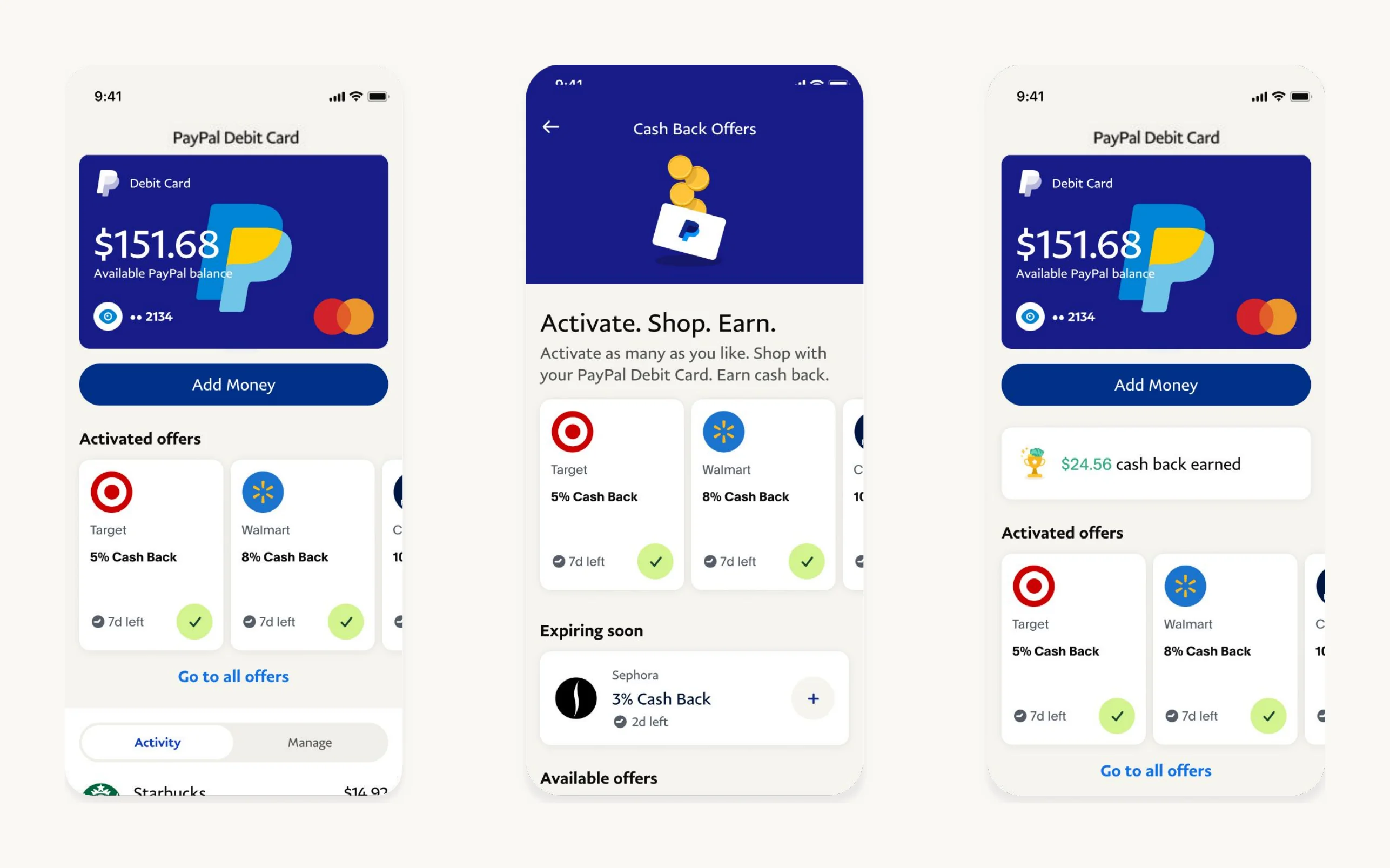
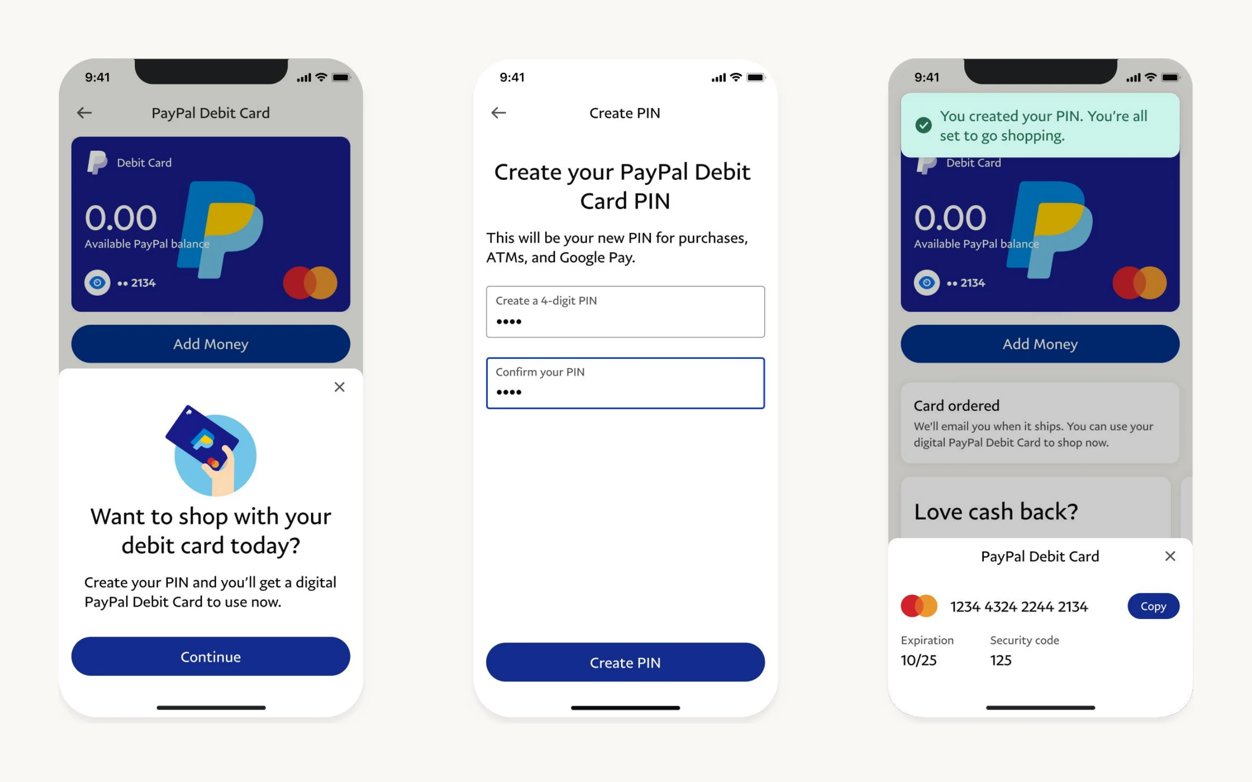
Every dead end got a way forward: a failed identity check offers a document upload instead of starting over, ITIN holders get their own path, an address that can’t be verified comes back with a suggested match, PINs that don’t match are caught on the field, and an empty offers hub says when the first offers arrive.
The situation
68% of people who started applying for the card gave up.
The PayPal Cash Card is a debit card that spends your PayPal balance. Signing up for it was slow and complicated, and the card had no rewards at a time when competing debit cards were selling on cash back.
What people were asking
“Do I have to load cash onto it?”
The name “Cash Card” suggested a prepaid card you top up, not a card that spends the balance you already have.
“What does it pull money from?”
People couldn’t tell whether it was tied to their PayPal balance, their bank or another card.
“Why this card and not another?”
Competing cards offered cash back and savings. This one offered neither.
“Can I use it before it arrives?”
For people who wanted a virtual card, there was no clear way to add it to a digital wallet.
The goal
- 68% → 40%
- Target cut in enrollment abandonment
- 1 flow
- Enroll in several cash back offers without leaving the card
My scope
I set the design direction for enrollment and rewards, and the product strategy behind it.
- What I owned
- Product strategy, ideation and design direction for the new card experience, and the stakeholder reviews that got it built. Hands-on, I designed the value prop, the enrollment steps and the cash back offers hub.
- The surface
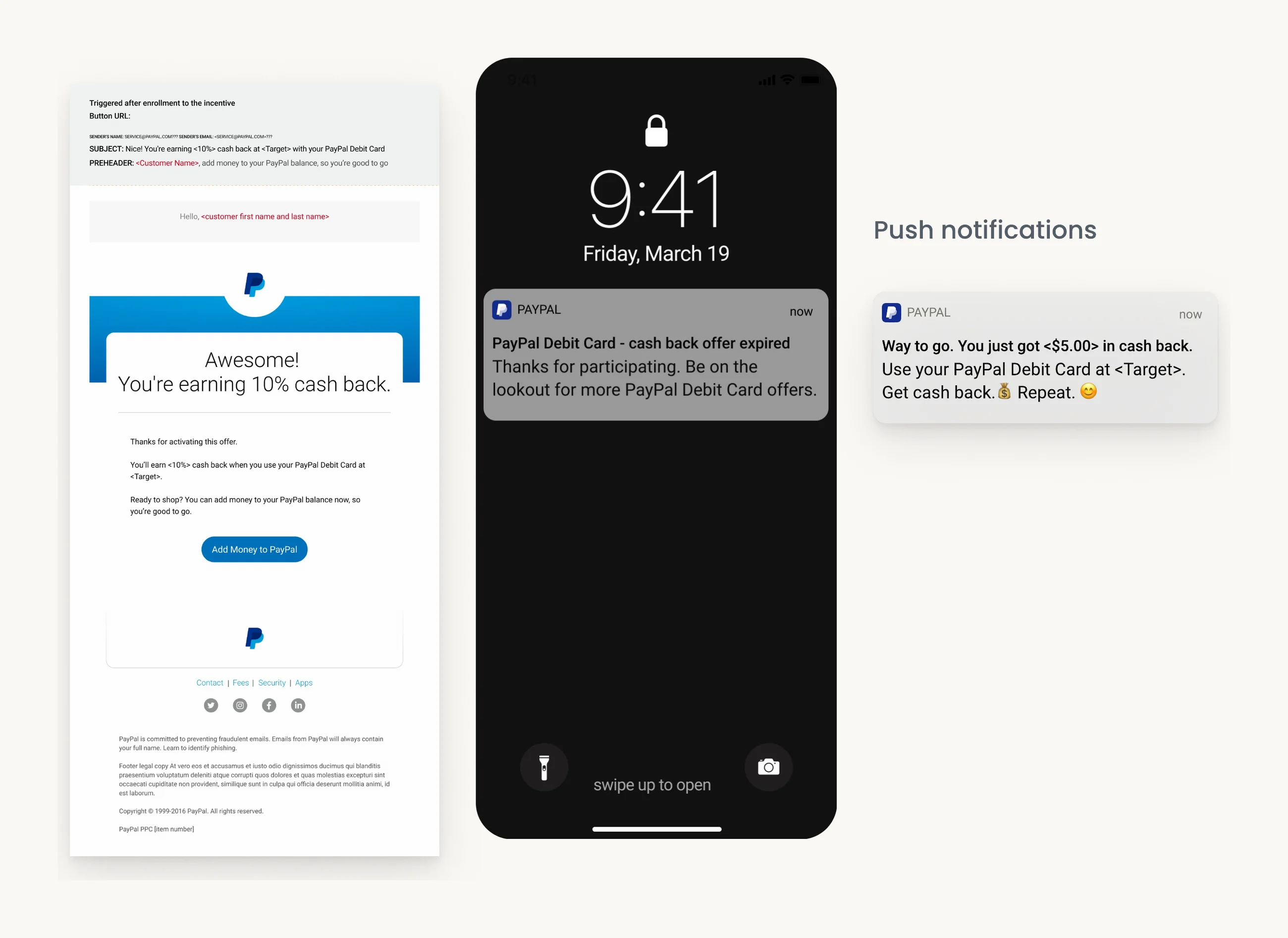
- Enrollment, the card’s home in the Finances hub, card details, adding money, the cash back offers hub, and the emails and push notifications that follow an offer.
- Who I worked with
- 2 product managers, 9 engineers across iOS, Android and web, compliance and legal, The Bancorp Bank as issuer, 1 researcher, and 2 product designers: one on card home and settings, one on notifications.
- How it was measured
- Enrollment abandonment first, then application time, same-day activation, support calls and NPS.
The strategy we worked to (PayPal’s five pillars)
Lead with cash back
Wherever possible. It was the clearest difference from other debit cards.
Say what funds it
Make it obvious the card spends your PayPal balance, in stores and online.
Simple and in context
Show each step, offer and prompt where the person already is in the app.
The hard call
The goal was fewer drop-offs. I designed for confidence, not speed.
The obvious fix for 68% abandonment was fewer screens: push the fees and issuer copy out of the way and get people to the submit button faster. It would have moved the number for a quarter. I argued the drop-off came from doubt, not length: people didn’t know what a "Cash Card" was, what funded it or what it cost.
So Cash Card became Debit Card, the first screen leads with where you can use it, the fees sit on that same screen behind collapsible rows, and the identity questions say why they’re asked. The flow got a little longer to read and faster to finish, because people stopped backing out to check.
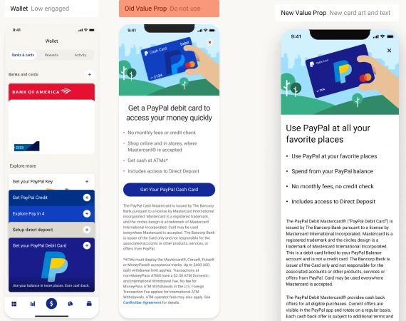
I designed less for conversion and more for confidence.
Working with constraints
Every screen had to carry a regulation, and still read in one glance.
Identity verification
US banking rules require legal name, a residential address (no PO box), date of birth and the last four digits of an SSN. The flow offers an ITIN instead, and explains why it asks, next to the fields.
Fee disclosure
The full fee list for the PayPal Balance account has to appear before anyone signs up. It sits on the first screen, behind collapsible rows rather than a wall of text.
Issuer copy
The Bancorp Bank issues the card under a Mastercard licence, and that language has to sit beside the call to action. The value prop puts the promise above it and the legal text below.
An existing native flow
Enrollment was built on PayPal’s existing native enrollment framework rather than from scratch, so the new steps had to fit its screens and its identity branch.
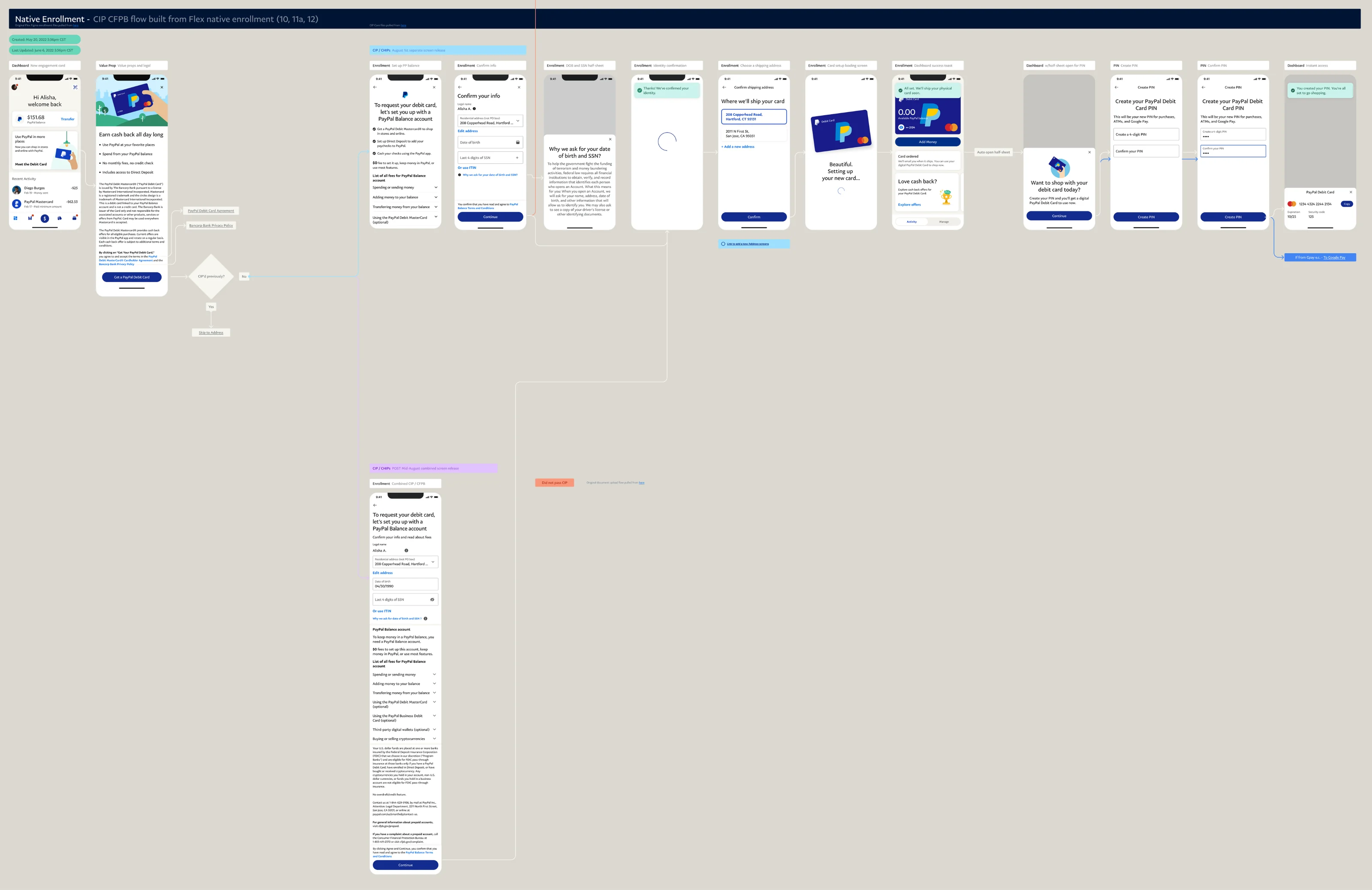
Legal first asked for the fee table as one static block. I negotiated collapsible rows with every fee name visible, which they accepted once each row opened to the exact regulated text. The issuer line stayed beside the button, so the promise moved above it instead of competing with it.
Impact
Faster to apply, faster to use, fewer calls about where the card is.
Business
- 20%
- Faster card applications
- 18%
- More cards activated the same day
- 25%
- Fewer support calls about shipping
Customers
- +9 pts
- NPS among debit card users
Enrollment abandonment fell from 68%, short of the 40% goal.
Measured over the first 90 days after launch against the 90 days before, on the same entry points. NPS from PayPal’s quarterly debit card survey.
What I'd do differently
Two things I’d do sooner.
I tested the new name late
Renaming Cash Card to Debit Card was the biggest single change, and it only reached customers after the flows were built around it. A five-minute name test in week one would have settled it before it shaped every screen.
Offers came second to enrollment
Most of the effort went into getting people signed up. The offers hub, the reason to keep using the card, shipped with an empty state I’d now design first: new cardholders saw it before they had any offers.
For the detailed case study, reach out to me (opens Gmail in a new tab).