Walmart Labs
Wal-E, a design system for enterprise
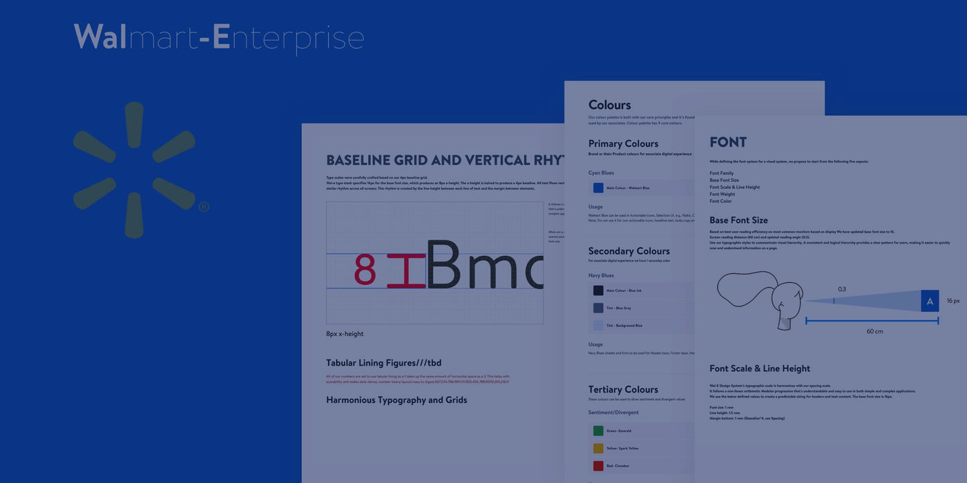
Wal-E: the Walmart enterprise design system — one source of truth for the components behind data-heavy internal products, built for form-dense screens and shared-floor touch devices.
Impact
- 9
- Core colours in the palette
- 4px
- Baseline every screen shares
- 3
- Guidelines per component: interaction, visual, usage
Case snapshot
The situation
Walmart already had design systems. None of them were built for this kind of screen.
The goal of Wal-E was to be the single source of truth for the library of UI components used to build Walmart product, usage and implementation guidelines included.
What made it a separate system was the surface. These were enterprise applications: data-heavy, dense with forms and fields, and used on many kinds of touch device by associates working in very different environments. A component set tuned for a consumer storefront does not survive a screen that is mostly input fields.
Why a system at all
Consistency
One answer to a component question instead of one per team.
Higher quality
The accessible, tested version is the default version.
Faster handoff
Better communication with engineering, and a faster design process.
Focus
More attention on UX, less spent re-deciding visuals.
My scope
I researched the surface, designed the components, and tested them for accessibility.
- What I owned
- Research into the existing products and the devices they ran on, to establish what the components had to survive. Then designing the elements themselves and testing their accessibility.
- The contribution loop
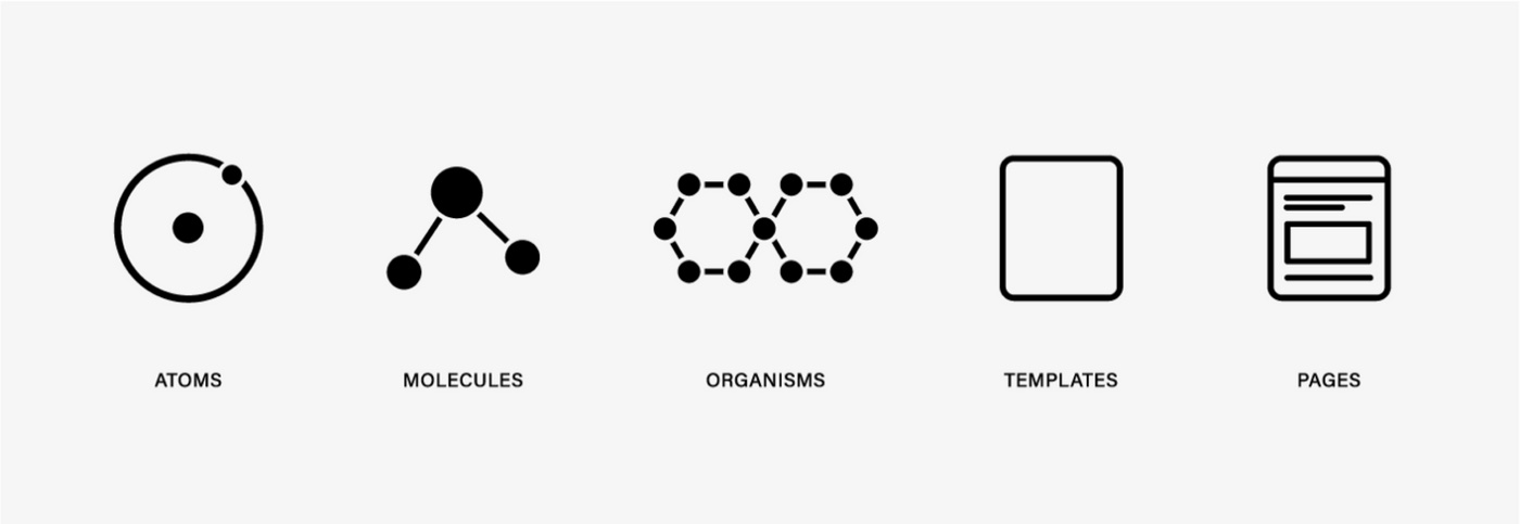
- Create — identify the need for a component, add it to Wal-E, and write its usage guidelines. Style — build it to the design specs in Wal-E so it functions correctly and matches those guidelines. Integrate — get the documented component into the product.
- Starting point
- Built from scratch for Walmart’s enterprise applications, not adapted from an existing library.
Accessibility was written into the system rather than bolted on. Walmart’s position was that everyone should be able to contribute, which meant designing and coding adaptively, whatever a person’s abilities.
The hard call
Building a separate system rather than bending the one that existed.
The call was to treat enterprise as its own problem — a system with its own component set, designed for data-heavy, form-dense screens and the touch devices associates use — instead of stretching Walmart’s existing systems to cover it.
That has a real cost: another library to maintain and another thing for teams to learn. The contribution guidelines were the answer to it — anyone could raise an issue, document a component or submit code, so the system did not depend on one team to keep up.
How the work got made
Every component shipped with three documents, not one drawing.
What a finished component included
Interaction
How it works.
Visual
How it looks.
Usage
How you should use it.
Around the components sat the rest of the system: the design philosophy the team worked to, contribution guidelines, page layouts and the grid, content guidelines for voice and tone, accessibility guidelines, and resources on both sides of the handoff — live code snippets for engineers, a Sketch pattern library for designers.
The craft
The decisions that show: colour, a 4px baseline, and the input field.
Foundations
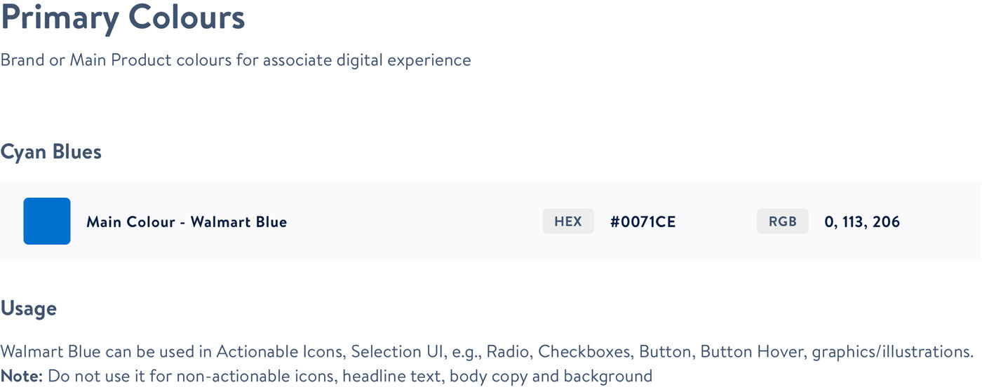
Colour
A palette of nine core colours, built on the system’s principles, for the digital products associates use.
Typography
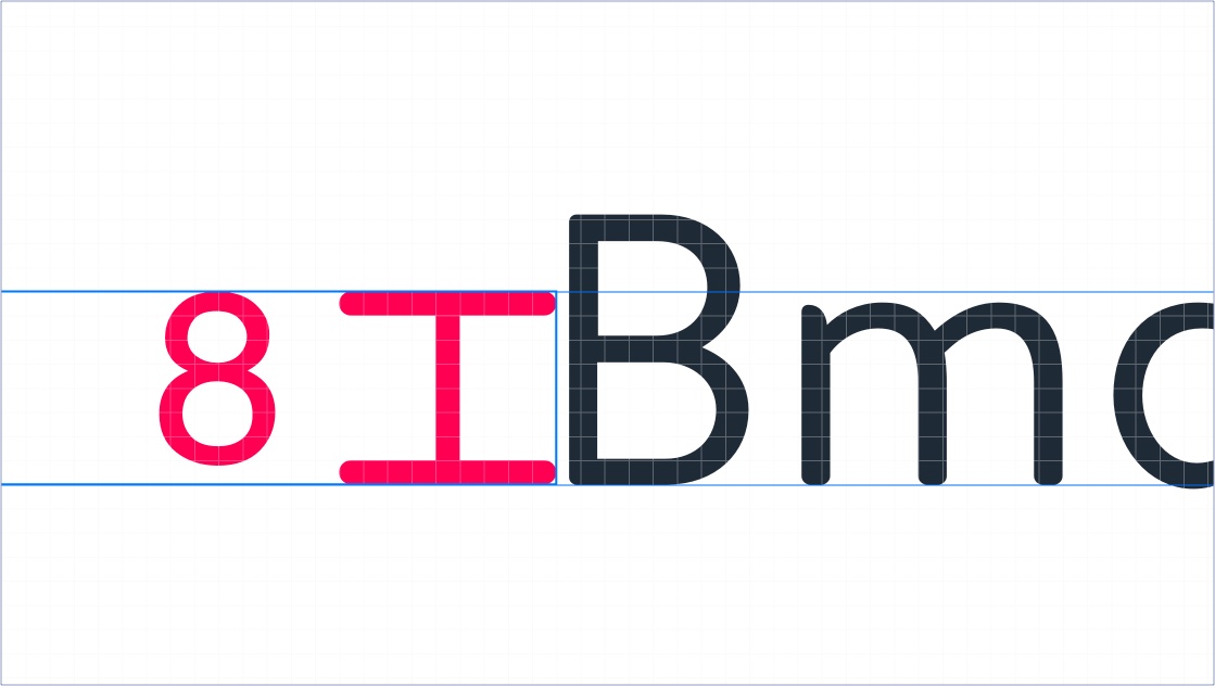
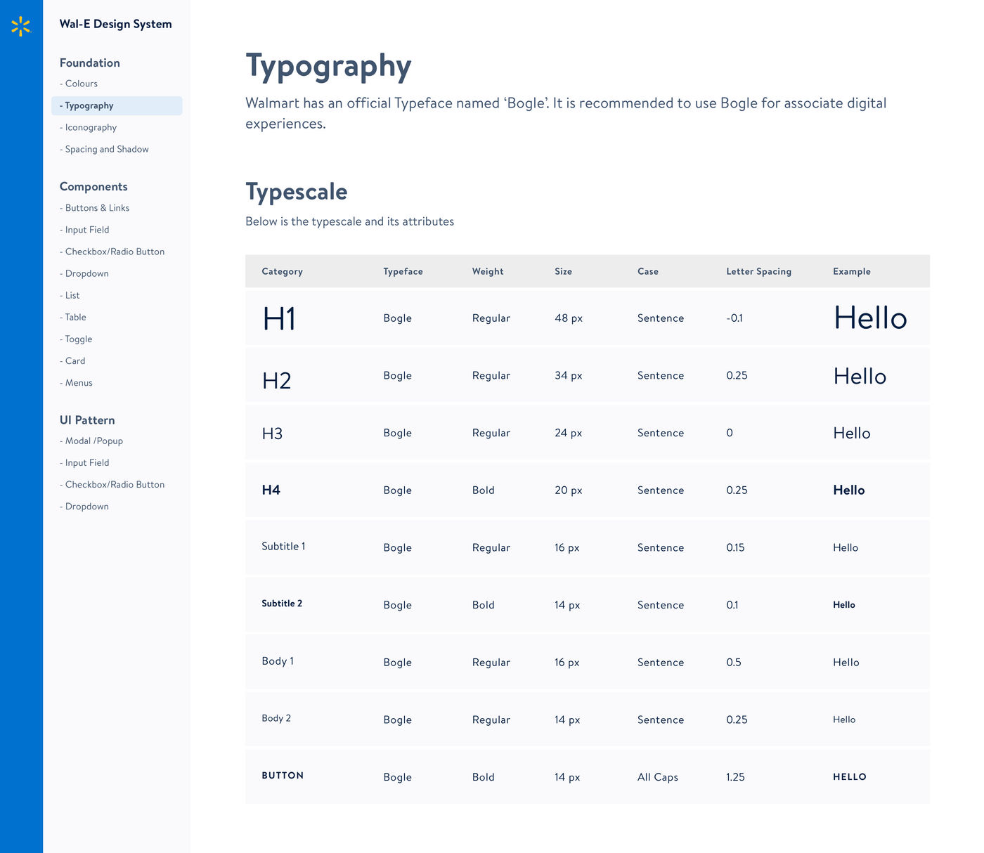
Bogle, Walmart’s official typeface. A 16px base produces an 8px x-height, halved to a 4px baseline; all text flows along it, so line height and margins share one rhythm across every screen.
Grids and spacing
Type scales crafted against the same 4px baseline grid.
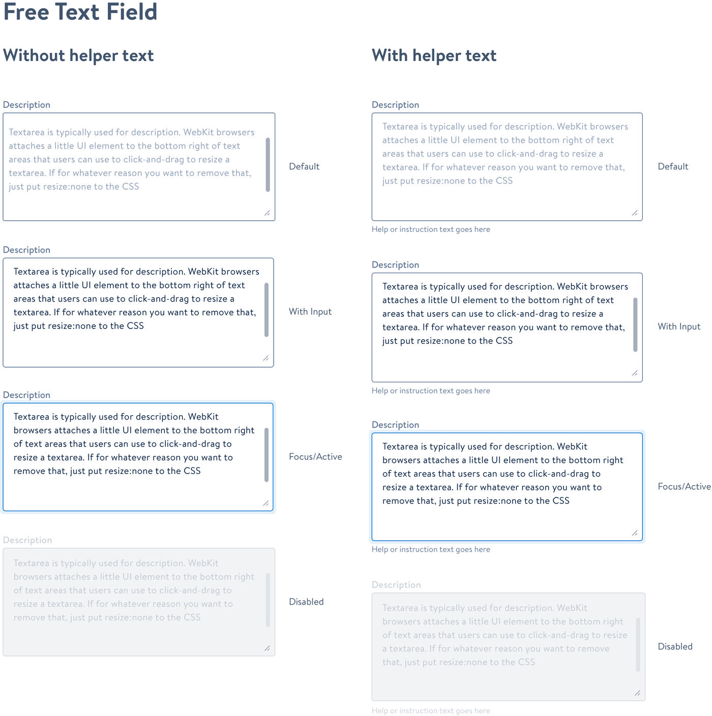
The input field got its own guideline, because the applications always need input from the user, one-off or repeated, in a single session. The guidance drew on the Baymard Institute’s usability studies, Material Design’s research, and current practice at Medium, Quora, Amazon, Airbnb and Atlassian.
What an input field has to get right
Visibility
High visibility of both field and label — an accessibility question before an aesthetic one.
Structure
The appearance of the field itself.
Behaviour
How it responds as it is used.
The label
Meaningful text for the field it names.
Assistive elements
Helper text, feedback and trailing icons.
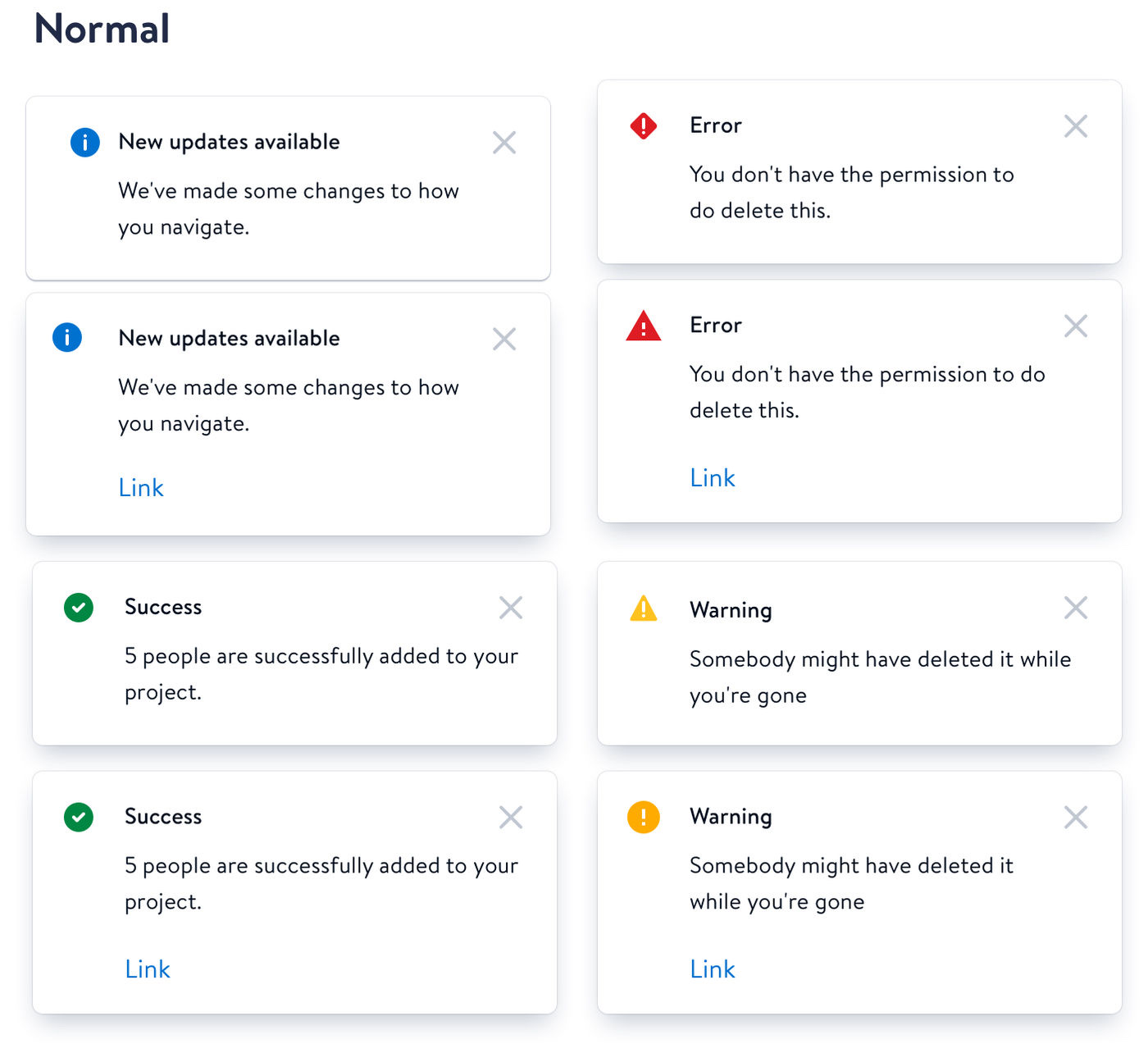
The second documented area was system status: indicators, validations, notifications and dialogue boxes. Keeping the state of the system visible is one of the ten usability heuristics, and the framing was flow — people are happiest absorbed in the task at hand, so status has to inform without pulling them out of it. Which pattern to use came down to the priority of the message, the type of information, whether it was global or contextual, and whether a user action or a system event triggered it.
Impact
One system the enterprise products could build on.
- 9
- Core colours in the palette
- 4px
- Baseline every screen shares
- 3
- Guidelines per component: interaction, visual, usage
For the detailed case study, reach out to me (opens Gmail in a new tab).