Walmart Labs
Scan & Go, in-store
Walmart Scan & Go: scan items with the Walmart app as you shop, pay on your phone, and skip the checkout line. From research to the first store pilot in a year.
Impact
- 25%
- Increase in basket size
- 15 min
- Average checkout time, reduced by 30 minutes
- 757
- New customers
Pilot, recorded 17 March 2021
Case snapshot
The situation
Checkout was the slowest part of a Walmart trip, and in 2020 the queue became a health question.
In February 2020 Walmart set out to make in-store shopping fast and contactless. The plan was a feature inside the Walmart app people already had, not a new app: scan barcodes as you shop, pay in the app with one touch, and show the receipt on your way out.
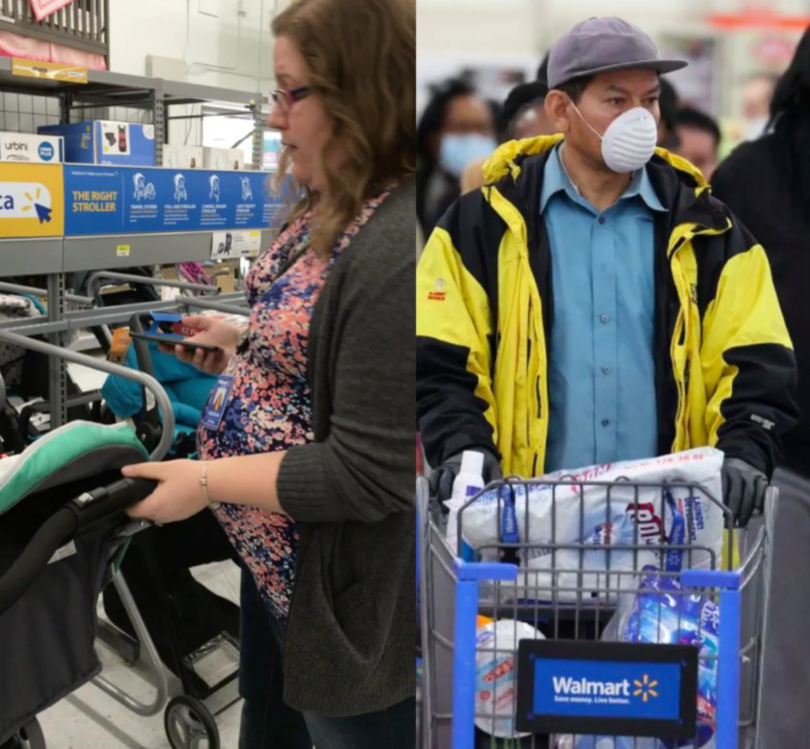
Other retailers were already using the phone to make store trips easier, and Walmart had nothing competitive. COVID raised the stakes. Standing in a queue and handing over a card became something people actively wanted to avoid.
What the research found
- 80%
- Of customers pay for in-store purchases by debit or credit card
- 90%
- Of shoppers actively avoid stores with long queues
- 54%
- Of members who come in to pick up an online order spend $100 more in store
The bet
Faster checkout, bigger baskets
A faster checkout would raise purchase frequency and basket size, and with them retention, measured before and after launch.
Card payers will pay by phone
With 80% of in-store purchases already on a card, paying on the phone while scanning is a small step.
Small baskets go first
Shoppers with a few items prefer an express exit to a long queue. That was already the lesson from Sam's Club.
My scope
Product designer on a team of eleven, from research to the pilot build.
- What I owned
- The end-to-end experience: entering Scan & Go from the Walmart app, scanning, the cart, paying, the exit pass, and every error state in between.
- Research
- Two to three months of research with the research team, done remotely, then in-store prototype testing with new and returning shoppers.
- Illustration and motion
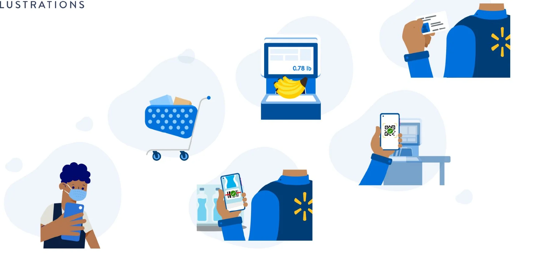
- I drew the feature's illustrations and micro-interactions in the Walmart design system's palette and style, and added them to the design library.
- The team
- Alongside me: 1 product manager, 1 user researcher, 1 content strategist and 7 engineers across iOS, Android and the store systems.
- What the first launch could not do
- It ran in a small set of stores (about 15% leakage possible), on a crunched timeline. Shoppers couldn't build a basket before the trip or compare prices, and offers and deals were out of scope. The first launch was a launch-and-learn: its job was to show how people actually adopt it.
The hard call
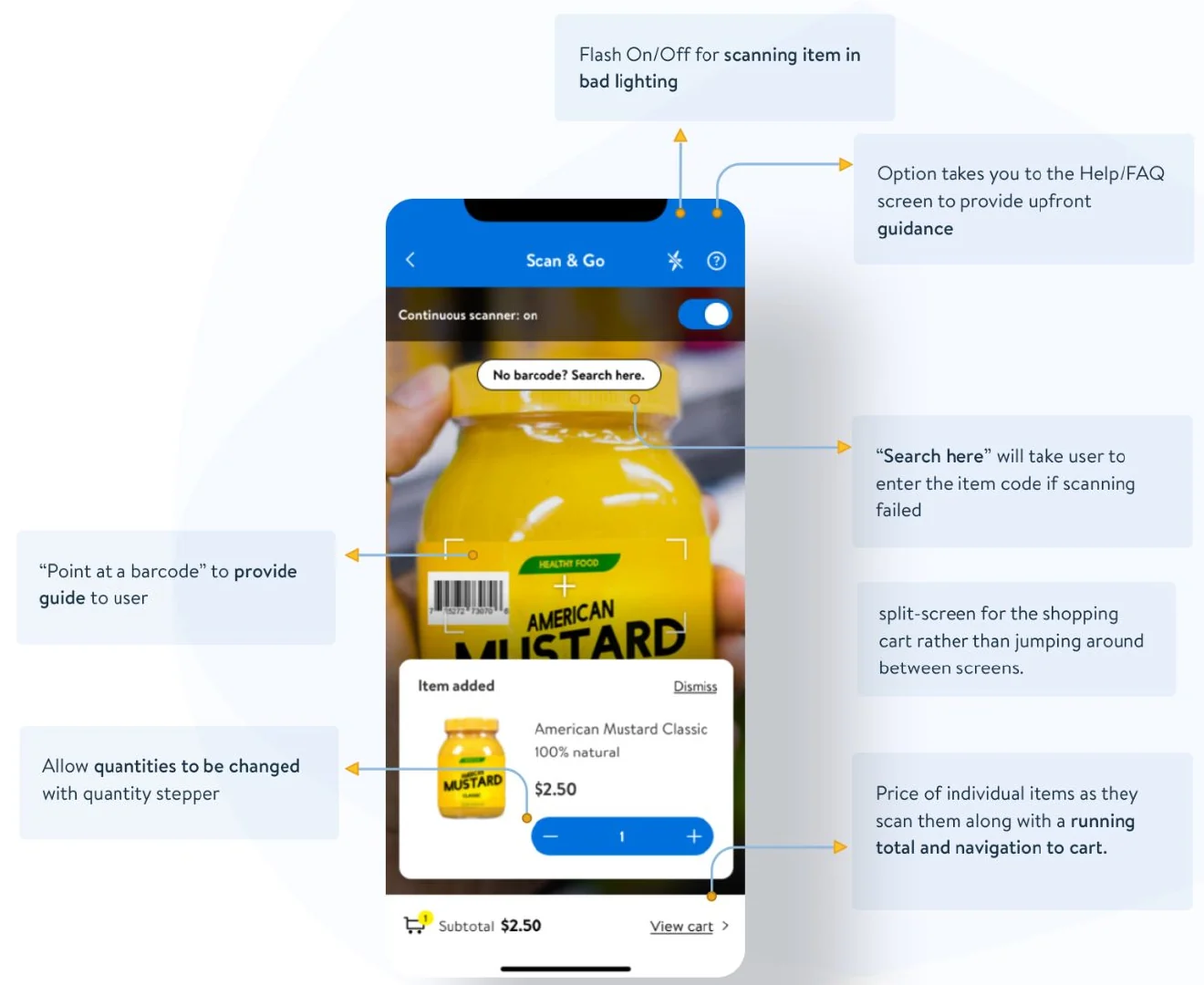
Testing showed the always-on scanner double-scanned. I kept it on and gave people a switch.
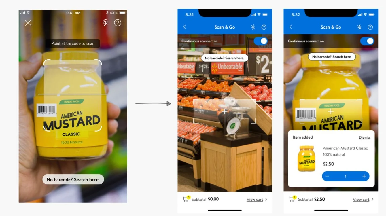
The prototype we tested scanned continuously: point the phone at a barcode and the item went into the cart. People found scanning intuitive and liked that a barcode read from any angle. They also scanned items twice by accident and didn't notice. The viewfinder felt slow, and they wanted clearer feedback that an item had been added.
Turning continuous scanning off fixes the double scans and slows everyone down, the first-time shopper and the regular with a full cart alike. Speed was the reason the product existed, so I kept the scanner on and fixed the two things that made a double scan easy to miss.
First, the scanner state became a visible toggle with an On/Off label, so people can stop it. Second, the screen split. The viewfinder sits on top, and the last item added, with its quantity stepper, sits under it beside the running total. A double scan shows up where it happened, as a quantity of 2, and one tap fixes it. Both changes were cheap to build.
How the work got made
Research set the guidelines, sketches set the journey, and the store tested both.
Research on how people scan and manage a cart
Before any screen: pain points in the store, what shoppers are trying to get done, what they buy, and how they felt about self-checkout during COVID. The user goals were to save time, keep their distance, and stay on budget.
The journey, on the wall
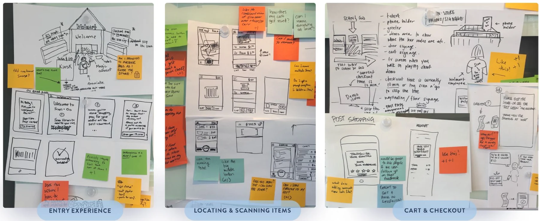
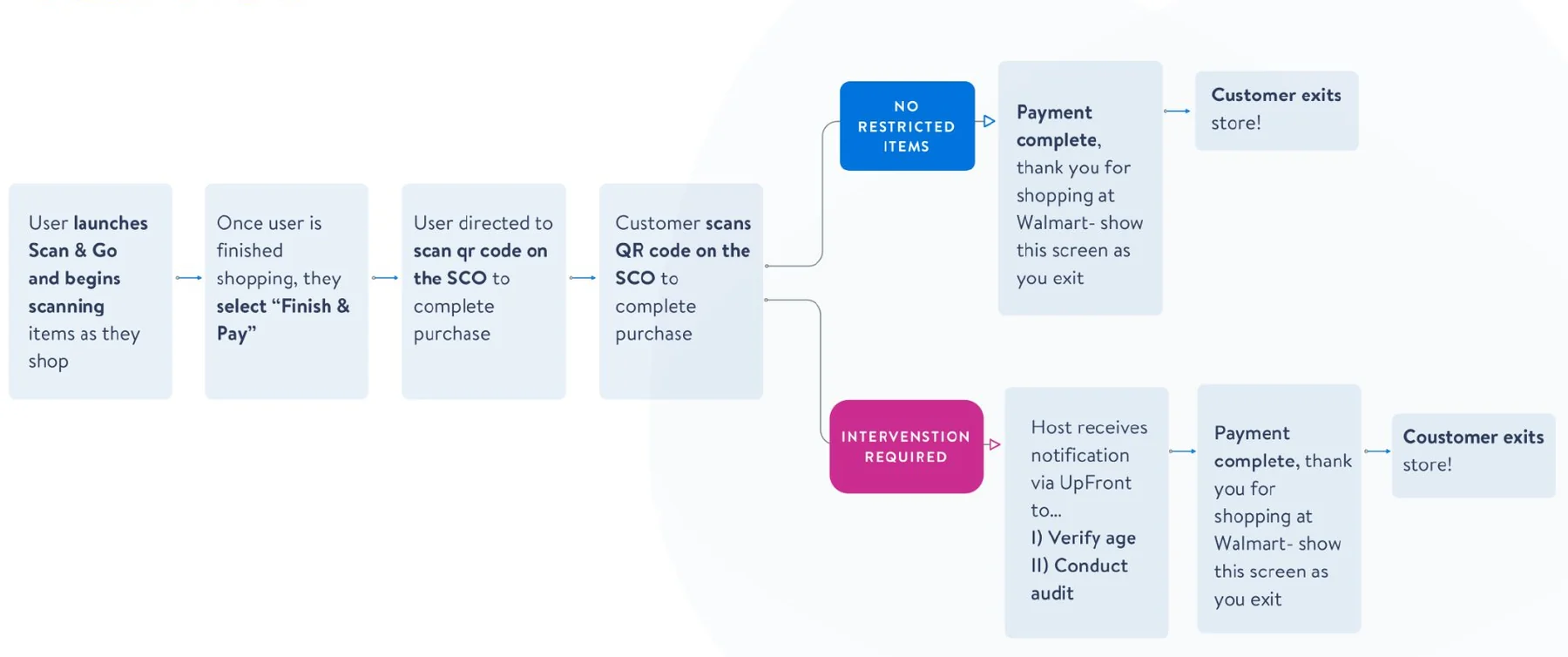
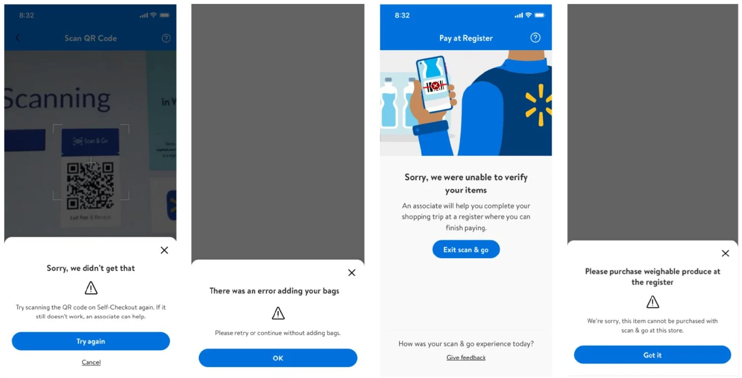
The journey was sketched in three stages: getting in, finding and scanning items, and cart and checkout. Then I listed the edge cases each stage had to survive: an out-of-stock shelf tag, a dead battery, the network dropping, a mis-scan that triggers an audit.
Six guidelines before hi-fi
Fewer clicks. Clear affordances. Consistent with the rest of the Walmart app. Visual aids for quick recall. Accessible. Exceptions that help people recognise, diagnose and recover.
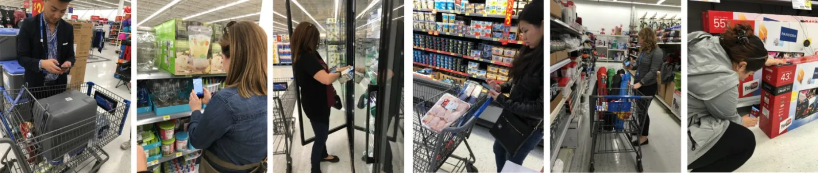
The in-store test ran on UserTesting.com with an InVision prototype. Tasks were written for real shopping: get into Scan & Go from the Walmart app, add bananas that need weighing, and find a 12-pack of Topo Chico. Then a prompt: your budget is $X, do you have enough left for another? That prompt tested whether the running total was doing its job.
The craft
Designed for one hand, a moving cart, and a store full of awkward items.
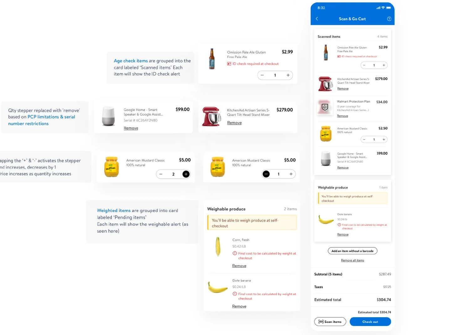
Age-restricted items
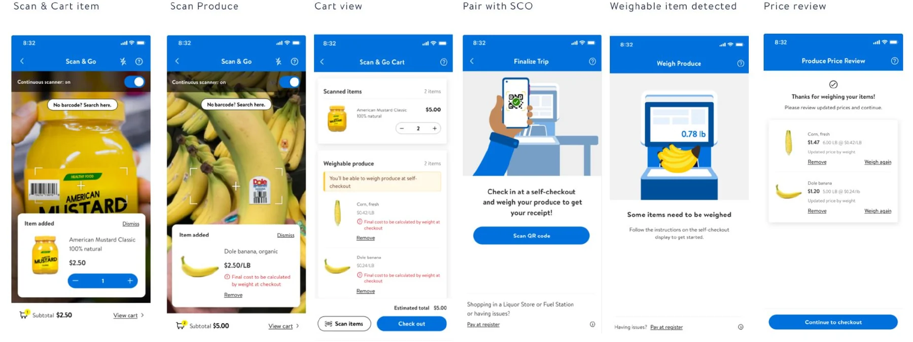
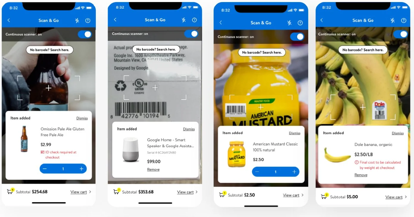
Flagged on the item as it's scanned, "ID check required at checkout", and grouped with everything else. The check happens at the exit, and the shopper knows before they get there.
Produce sold by weight
Sits in its own "Pending items" group: final cost calculated by weight at checkout. The shopper weighs it at self-checkout and reviews the updated price before paying.
Protection plans and serial numbers
A protection plan is attached to its item: remove one and the other goes too. Serialised items get Remove instead of a quantity stepper, because two of the same serial number can't exist.
Impact
A pilot in stores within a year, with bigger baskets.
Pilot, recorded 17 March 2021
- 25%
- Increase in basket size
- 15 min
- Average checkout time, reduced by 30 minutes
- 757
- New customers
I shopped at Walmart using the Scan & Go feature on its mobile app, and I didn't have to interact with a single person in the store.
A shopper, 25 February 2021
What came next
Every store
Scan-and-go purchasing at every physical store, which brings theft prevention and fraud into the design rather than the policy.
Edge cases as features
Low battery and lost or poor connection, designed for directly instead of caught by a generic error.
No barcode needed
Computer vision to recognise a product without its barcode, and to cut the time the app takes to identify it.
What I'd do differently
What the pilot taught me.
The rollout is part of the design
Communication was the most overlooked part of the launch: to customers, and to the associates on the floor. An associate who sees a queue forming and points people to Scan & Go does more for adoption than any screen.
The associate is a user
Hosts verify ages, run audits and rescue failed trips. Their experience belongs among the key metrics, not just the shopper's.
Edge cases are the product
In a store, a mis-scan, a weighable item or a dropped connection is normal. Designing those paths early is what made the happy path trustworthy.
For the detailed case study, reach out to me (opens Gmail in a new tab).